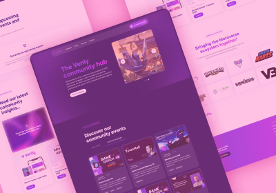
Designer Tips to Optimize Your Website for Mobile

Are you providing the best website experience for mobile users?
You might not think it makes a difference, but searchers experience websites differently on a mobile device than on traditional desktops or laptops. In fact, some might go as far as saying the entire use case on a mobile device is different, which means whatever your desktops users need and expect can completely differ from those of mobile users.
In another blog we gave four reasons why optimizing the user experience for mobile is so important.
Are you delivering a mobile-optimized experience? Let’s take a closer look at why it matters and what you can do to improve your website design for mobile users.
Friction and Mobile Optimization
One of the biggest problems of websites that aren’t catering to the mobile audience is friction. In digital terms, friction is defined as interactions that inhibit people from intuitively and fluently achieving their goals on a mobile website.
So, when people struggle to use your website with their thumbs because they have to zoom in to read a text block or because they can’t click a super small button, friction occurs.
Why does this matter?
Friction kills conversions.
This is because a mobile user’s goals can vary greatly from those of a desktop user. When someone uses a mobile device to find information, they’re typically looking for something highly specific or are ready to take action on a decision. Studies show that over half of mobile users who search for a local business make a visit that very same day.
But to get to that point, they must first find the information they’re looking for. And if they have a poor website experience on your website, chances are they’ll head to a competitor that’s taken care to optimize their website for mobile users.
With a mobile-responsive design, many of these issues are easily fixed. But even with a responsive website, there are issues and insights to keep in mind.
Think How People Use Their Thumbs
Are you reading this article on your phone? How are you scrolling? I bet you’re using your thumbs.
75% of people only use one thumb to navigate on their phones, so this is an important thing to keep in mind when designing your website for mobile.
Mobile UX design expert Steven Hoober wrote a great in-depth article about how people use their thumbs to navigate on mobile phones. Because there are zones that are harder to reach with your thumbs, he created a hierarchy where the most important content will be placed on the easy-to-reach zones.
The user’s focus is always on the center of the screen, so that’s where you want your primary functions. Secondary functions, such as tabs or search fields, should be along the top and bottom edges. Tertiary functions can be hid behind menus.

Optimize Forms for Mobile
Typing is hard on a smartphone. The keys are tiny and autocorrect isn’t always accurate. If you want your customers to fill out forms, you need to make those forms finger-friendly and super simple.
One way to do this is by making the forms shorter. Consider what information is truly necessary for your business. Try to experiment to see whether dropping a field leads to more submitted forms.
A second way to optimize forms is by making it more easy to complete. For example, many forms only require the user to type the first letters of his/her address, and then let the user pick the correct street name from a list.
A third way is to get the information from your user’s social channels. Your user will be able to fill out most of the form with a single click, but some users are not that keen on giving you their Facebook or LinkedIn information.
Whichever way you choose, understand that the investment you make in changing how you handle forms now can potentially pay off big in the long run.
Add Clickable Phone Numbers and Addresses
One of the biggest advantages of using mobile search is the ability to call or navigate to a location with a single click. If you haven’t enabled such features on your website, you can almost bet you’re losing business.
If you’re designing a website for a restaurant or a store, you can expect that many people will use the website to call for a reservation or to look up the address as they are stepping into their car. You want to optimize the website to make these actions as easy as possible:
To do this:
- Add a link to your phone number so a user can simply click on it to call. Linking to "tel:111222333" will do the trick.
- Add the location link from Google maps to your address so clicking it opens up Google Maps.
It’s a simple fix that many developers overlook, but it can truly pay off big.
Drop the Navbar and Opt for a Hamburger Menu
When designing your website for the small screen, every pixel counts, and you don’t want the navigation bar to use your precious space just to sit there. The most popular method to do this is by using a hamburger menu, which unfolds into a larger menu when clicked.
Scale Down Images
High-quality images look great on mobile and desktops alike. But when you upload a 1000×1000 pixel image for that tile with a maximum width of 500 px, the browser loads more data than necessary. When your user loads the image on his or her phone, with a width of 100 px, the browser will load ten times more than necessary.
Load time complicates conversions. When it comes to optimizing for mobile, it is important to scale your image before uploading them to your website.
Optimize Your Mobile Website Speed
We covered in a previous article the importance of website speed, where even a one-second delay can have a huge impact on your customer satisfaction, visibility, and conversions. This is especially true on mobile phones.
While mobile phones have become more powerful and mobile networks become faster, the mobile data speeds are still slower than broadband data speeds. Google research stated that a one-second to three-second page load time increases the probability of bounce (visitors leaving your website instantly) by 32%.

You can analyze your website’s speed via Google Pagespeed Insights. On the mobile tab, you can read suggestions from Google to optimize your mobile website speed.
Limit the Use of Text
Text blocks may seem okay on desktops but can easily be overwhelming on smaller screens. Limit the amount of text on your website and only use it when absolutely necessary.
Adopt a Mobile-First Strategy
Optimizing a website for mobile is too often considered an afterthought in the design process. Instead, you may want to consider a mobile-first strategy that allows you to design for mobile devices as a primary connection.
From there, you can scale it up and build the desktop design. If your website is functioning flawlessly on mobile devices, it should work well on your computer, too.
Get Help With Mobile Optimization
In today’s mobile era, neglecting to invest in mobile optimization isn’t an option. Mobile usage is continuing to increase, even after having surpassed the mobile-desktop tipping point.
If you’re struggling to integrate a strong mobile experience with your design, contact us today to learn how we can help you build a standout website that caters to every type of user.
Start building today
Streamline your creative process and keep your team aligned with our collaboration tool.


